Introducing PaceKit UI - Build faster with practical UI blocks for real appsPaceKit UI - Blocks for real apps

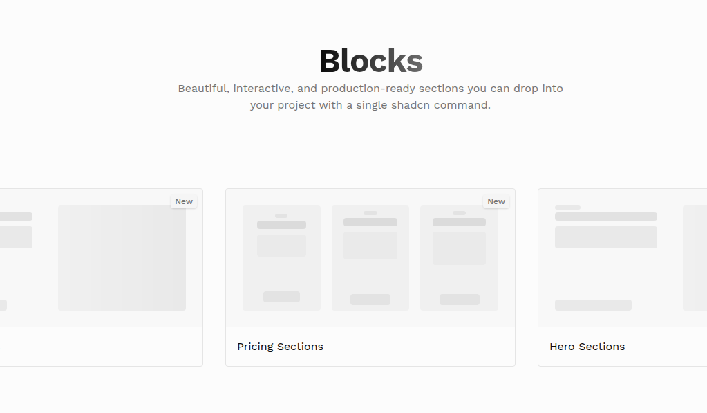
Building Blocks
Interactive animations
shaping every experience
Animated GSAP components crafted for smooth interaction and rich detail. Copy, customise, and create without the extra setup.
Classic White Tee
$29
Sizes
Chart
Small
Medium
Large
Colors
Custom color?
Available in stock
Toggle
Hover Me
Animate with GSAP
Built-in Animation
Smooth natural transitions by default, powered by GSAP for reliable and fluid performance.
Instant Setup
Start fast with shadcn CLI and Tailwind CSS. No config needed, just run the command and build instantly.
Adaptive Design
Fits any layout or theme. Customize quickly or use as-is across projects, sections, screen sizes.
Demos
Preview interactive examples and see them in action.